When I joined Greenlight, I started off working on a product feature team but quickly saw the need for a design system. Here is a quick overview of what I was working with…
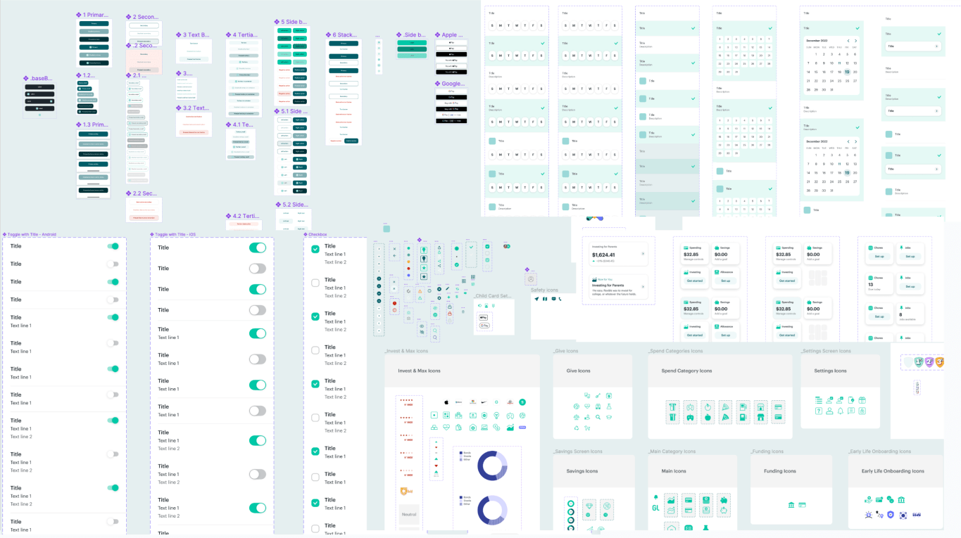
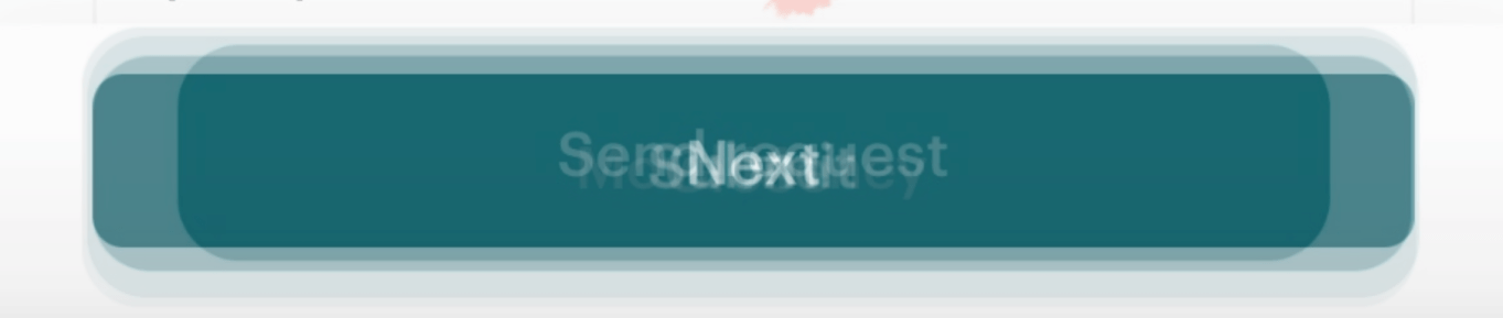
In Figma, it looked ok.
In the production app, another story.
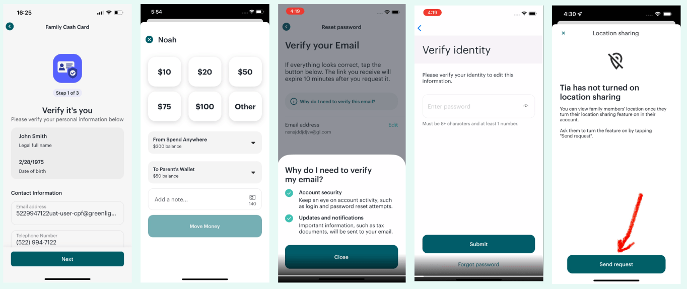
Clearly we were a little inconsistent.
Buttons of all shapes and sizes. If we were inconsistent with our primary action buttons, I can’t even imagine the can of worms I was about to open.
Why do we need a design system?
Product designers and developers can create and build a consistent user experience across our entire app.
Product designers and developers can design and develop new features quicker.
Releases are less error-prone when leveraging “tried and true” component from a code library.
Whenever it is justified to design and build a “new” component, it can be designed and built according to the design system rules/guidelines and then added to the system for all teams to use.
What are we missing?
Dedicated engineering and design support.
Code consistency and parity with design.
A common language between teams when referencing certain components.
I started with some brainstorming and auditing
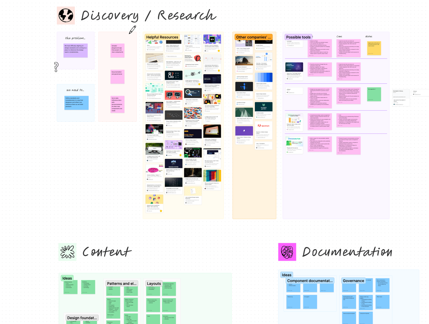
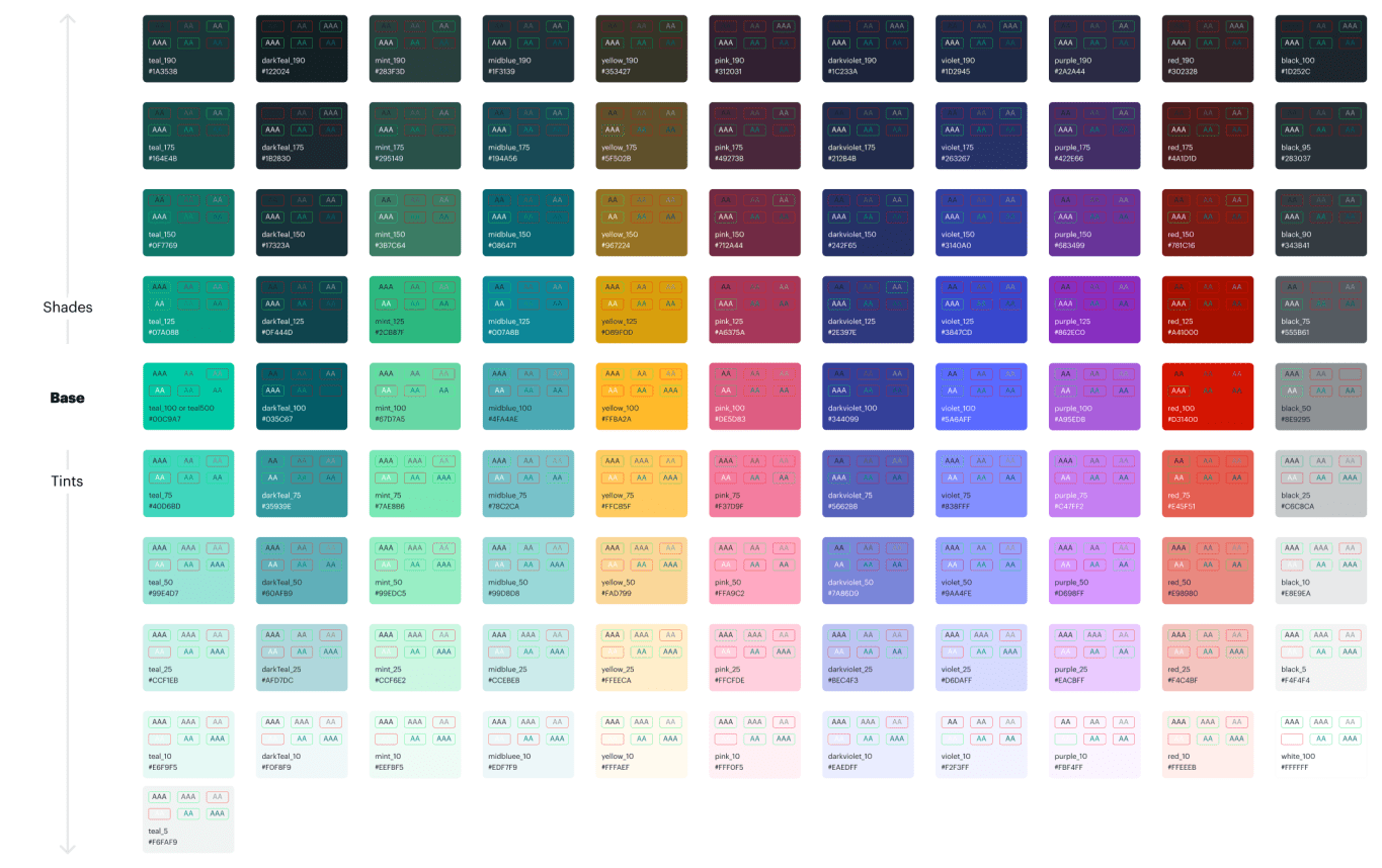
Colors
Created a global palette
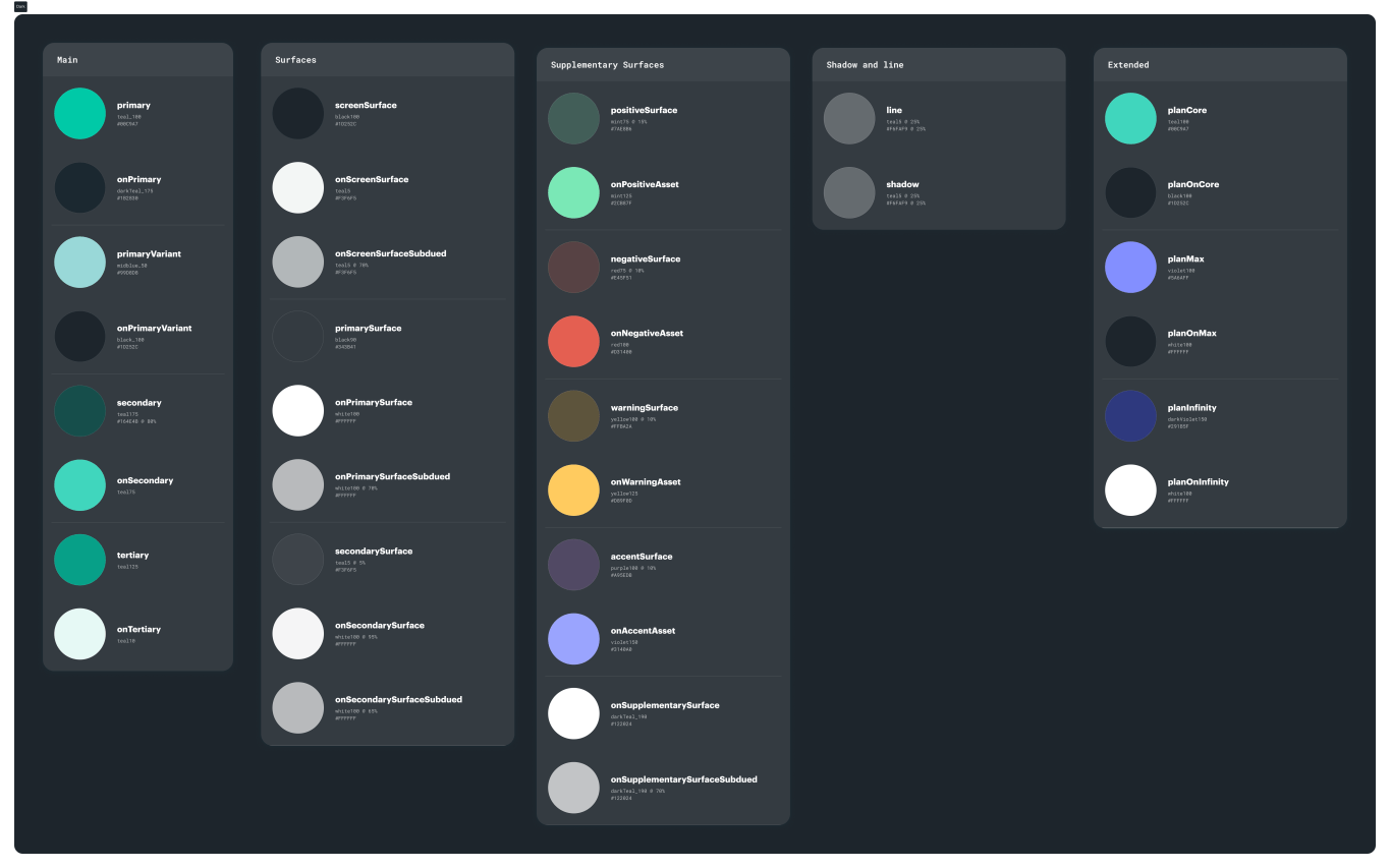
Semantic naming layer

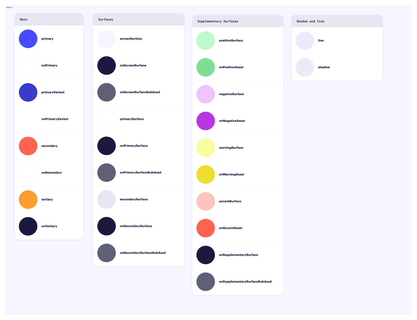
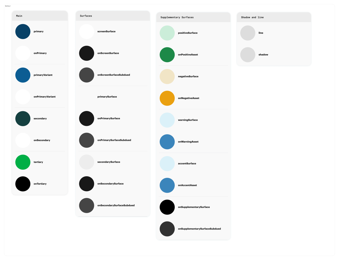
Other themes
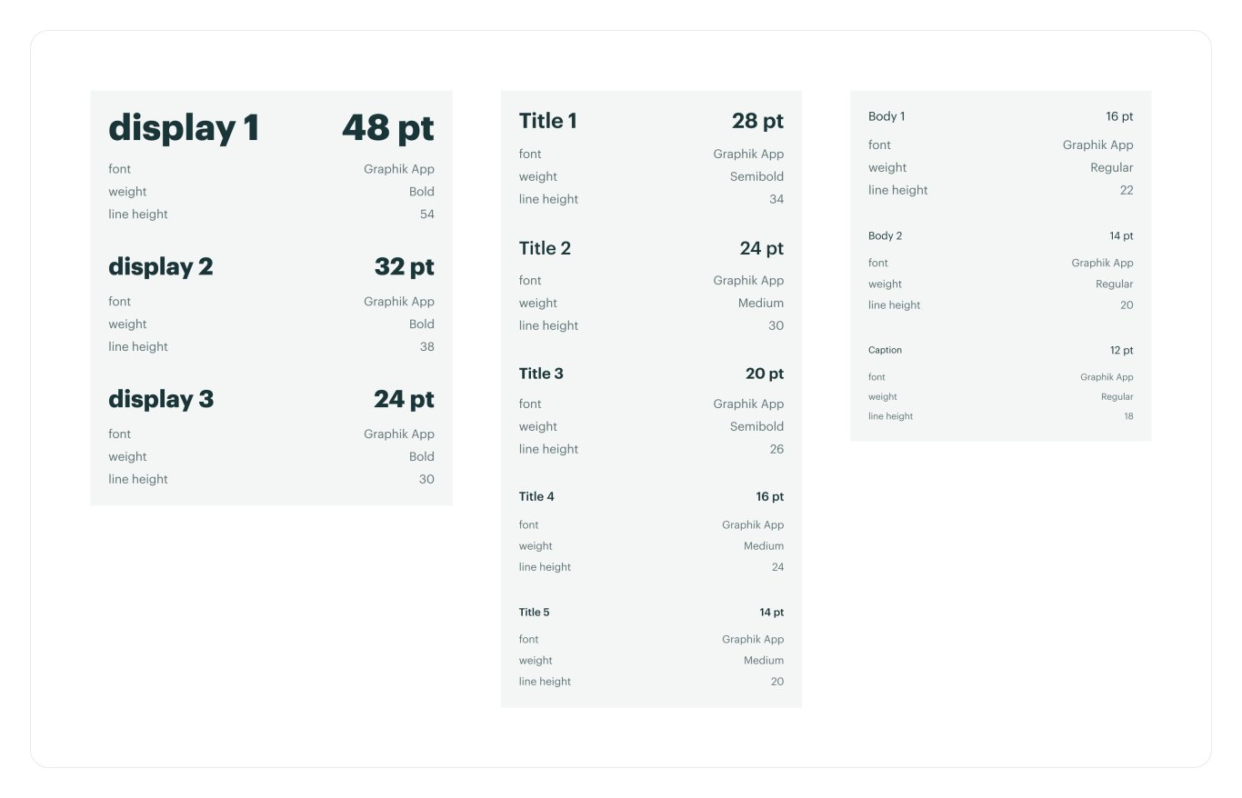
Fonts
 Marissa Taylor